

PROJECT NAME:
COUCOU FRENCH PATISSERIE
BRAND WORDS:
WARM, FEMININE, FRENCH
BRAND Purpose:
To brighten days with French, sweet treats that feel like a warm hug, taste like home, and invite connection for anyone needing a pick-me-up.
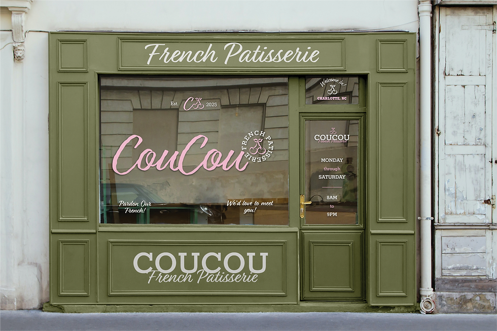
Coucou's brand identity was designed to capture its sweetness before you even walk through the door. This brand speaks to women and young people craving a tasty treat or a thoughtful gift, blending artisan quality with Parisian charm. With fun "ooh la la" sayings and a rustic pink and green color palette, Coucou feels both whimsical and chic.
The logo features a textured cursive font that feels nostalgic while keeping it feminine. With warm and charming supporting fonts and a hand-drawn cherry mark, the identity combines the right amount of charm and sweetness, inviting customers to fall in love at first sight.